
In this short tutorial, we will review some examples of how you can use the progress_bar_for_react package.
This is a simple package that I wrote some time ago, in order to provide a customizable React Component which will display a progress bar.
It can be useful in step builders, mp3 players, to depict download progress, and in general whenever there is a need to display a progress bar that will listen to an event.
So let’s start step by step.
Step 1
For this tutorial, I am going to create a new react project with create-react-app. First, you will need to have Node and NPM installed in your system first. Then you can install create-react-app globally with the command
npm install -g create-react-appStep 2
After installing create-react-app you can create a new React project with the command
npx create-react-app progress_bar_for_react_tutorial
This command will create a new folder with the name progress_bar_for_tutorial. If you navigate to the new folder you can see that the create_react_app created a react project that can be used and customized accordingly.
Step 3
Let’s go to the project and start the new React project
cd progress_bar_for_react_tutorialnpm start
The commands above will start the project and see the initial content that is already created by the create_react_app application.
If you were successful a tab will open in your browser containing an image like the below.
Step 4
Now it is time to install the progress_bar_for_react package. You can use the command
npm install --save progress_bar_for_reactAfter the installation is complete, we can use the package in our project.
Step 5
First, you have to clear the code in the src/App.js file and import the progress bar for react package.
Simple Usage
import { ProgressBarContainer as ProgressBar } from "progress_bar_for_react";
import "./App.css";

function App() {
  return (
    <div>
      <ProgressBar percentage={50} />
    </div>
  );
}

export default App;
The above snippet code will render a progress bar with its simplest syntax as it is shown in the image below.
The percentage property is set to 50% and will fill half of the available width of the progress bar.

Usage With Tooltip
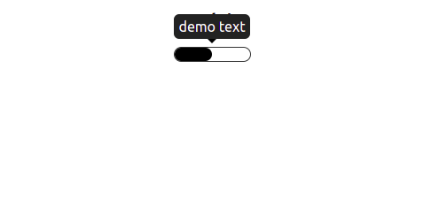
If we want to render a progress bar with a tooltip text that will display on hover we can use the following snippet
import React from "react";
import { ProgressBarContainer as ProgressBar } from "progress_bar_for_react";

function App() {
  return (
    <div style={{ marginTop: "20px" }}>
      <ProgressBar percentage={50} tooltip="demo text" />
    </div>
  );
}

export default App;
That will render the following
Complex usage
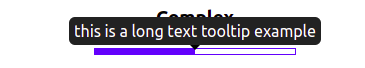
If we want to style the progress bar we can use the fillerExtraStyles and progressBarExtraStyles properties as it is shown in the example below
import React from "react";
import { ProgressBarContainer as ProgressBar } from "progress_bar_for_react";

function App() {
  return (
    <div style={{ marginTop: "20px" }}>
      <ProgressBar
        percentage={50}
        fillerExtraStyles={{
          backgroundColor: "blue",
        }}
        progressBarExtraStyles={{
          position: "relative",
          height: "50px",
          width: "200px",
          borderRadius: "1px",
          border: "1px solid blue",
        }}
      />
    </div>
  );
}

export default App;
The above snippet will render the following
Clocked
It is possible to dynamically update the percentage depending on an external event. In the following example, I am demonstrating keeping in the state the current percentage and using a time interval that will update the percentage every 100 ms.
import React, { useEffect, useState } from "react";
import { ProgressBarContainer as ProgressBar } from "progress_bar_for_react";

function App() {
  let [percentage, setPercentage] = useState(0);

  useEffect(() => {
    const interval = setInterval(() => {
      setPercentage(percentage++);
      if (percentage === 100) {
        setPercentage(0);
      }
    }, 100);
    return () => clearInterval(interval);
  }, [percentage]);

  return (
    <div style={{ marginTop: "20px" }}>
      <ProgressBar
        percentage={percentage}
        tooltip={`${percentage}%`}
        fillerExtraStyles={{
          backgroundColor: "blue",
        }}
        progressBarExtraStyles={{
          position: "relative",
          height: "5px",
          width: "200px",
          borderRadius: "1px",
          border: "1px solid blue",
        }}
      />
    </div>
  );
}

export default App;
The above snippet will render the following

Summary
In this short tutorial, I provided some useful examples of how to use the NPM package of progress_bar_for_react.
I hope it will help you understand its usage and will serve your projects. The code for this tutorial is available in the following Github repo.
If you want to know how an article written by the ChatGPT looks like, you can continue reading here.
Happy coding!